NGRNNGRNNGRNNGRNNGRNNGRN
NGRN
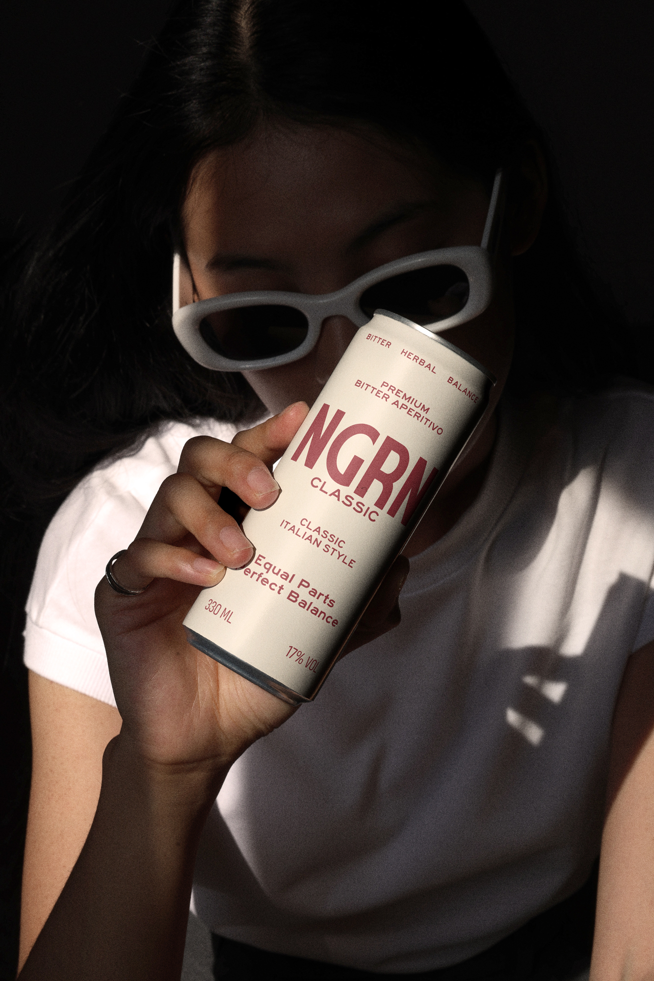
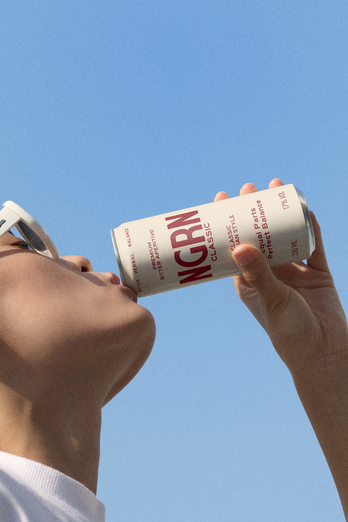
Canned Negroni for those who know the classic. No reimagining, just precision—spirits in a format that skips the 15-minute wait. Pure dignity
Overview
Redefining the aperitif standard for urban culture
Picture the pulse of the city as the sun sets, the fogged glass, and the perfect equilibrium of botanical bitterness. NGRN embodies that essence. Now, add a twist: that signature mixology experience, evolved beyond the traditional bar.
Focused on technical precision and ingredient purity, NGRN partnered with us to venture from the classic ritual into a new realm of portable sophistication.
Focused on technical precision and ingredient purity, NGRN partnered with us to venture from the classic ritual into a new realm of portable sophistication.
- #A02A33
- #E24D3C
- #DC602A
- #FF7F84
- #F2E4D2
Immersion
The catalyst for a new consumer landscape
Today’s consumers demand curated, honest experiences. Recognizing the friction between the complexity of classic mixology and the need for immediacy, NGRN joined our team to forge an Innovation Roadmap.
This led us to deconstruct the anatomy of the Negroni, introducing a brand architecture that offers a refreshing and bold take on the essence of traditional bitterness, tailored to the rhythm of modern life.
This led us to deconstruct the anatomy of the Negroni, introducing a brand architecture that offers a refreshing and bold take on the essence of traditional bitterness, tailored to the rhythm of modern life.
Brand Strategy
Distilling a new strategy: Where is NGRN headed?
Faced with the challenge of digitizing a nearly century-old classic, the question was inevitable: What’s the next move? Guided by our expertise, we didn't just draft fleeting strategies; we wove narratives and painted a vision for tomorrow. At the core of this transformation was our Foundation program.
Designed exclusively for visionary teams seeking a unique strategic compass, Foundation is our commitment centered on pure strategy. By partnering with us, NGRN aimed for innovation, setting its sights on revolutionizing the Ready-to-Drink (RTD) landscape.
Designed exclusively for visionary teams seeking a unique strategic compass, Foundation is our commitment centered on pure strategy. By partnering with us, NGRN aimed for innovation, setting its sights on revolutionizing the Ready-to-Drink (RTD) landscape.
Visual Identity
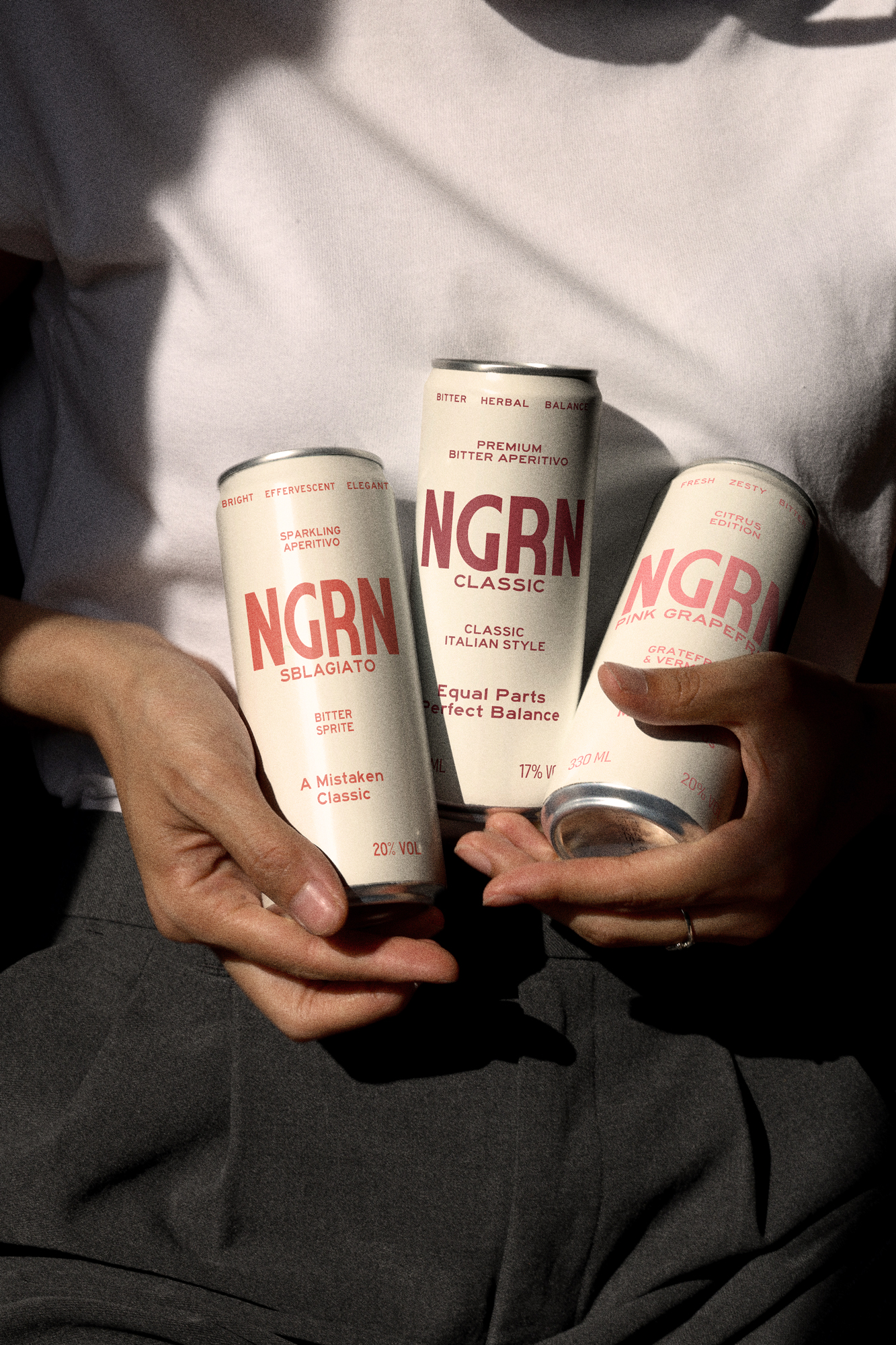
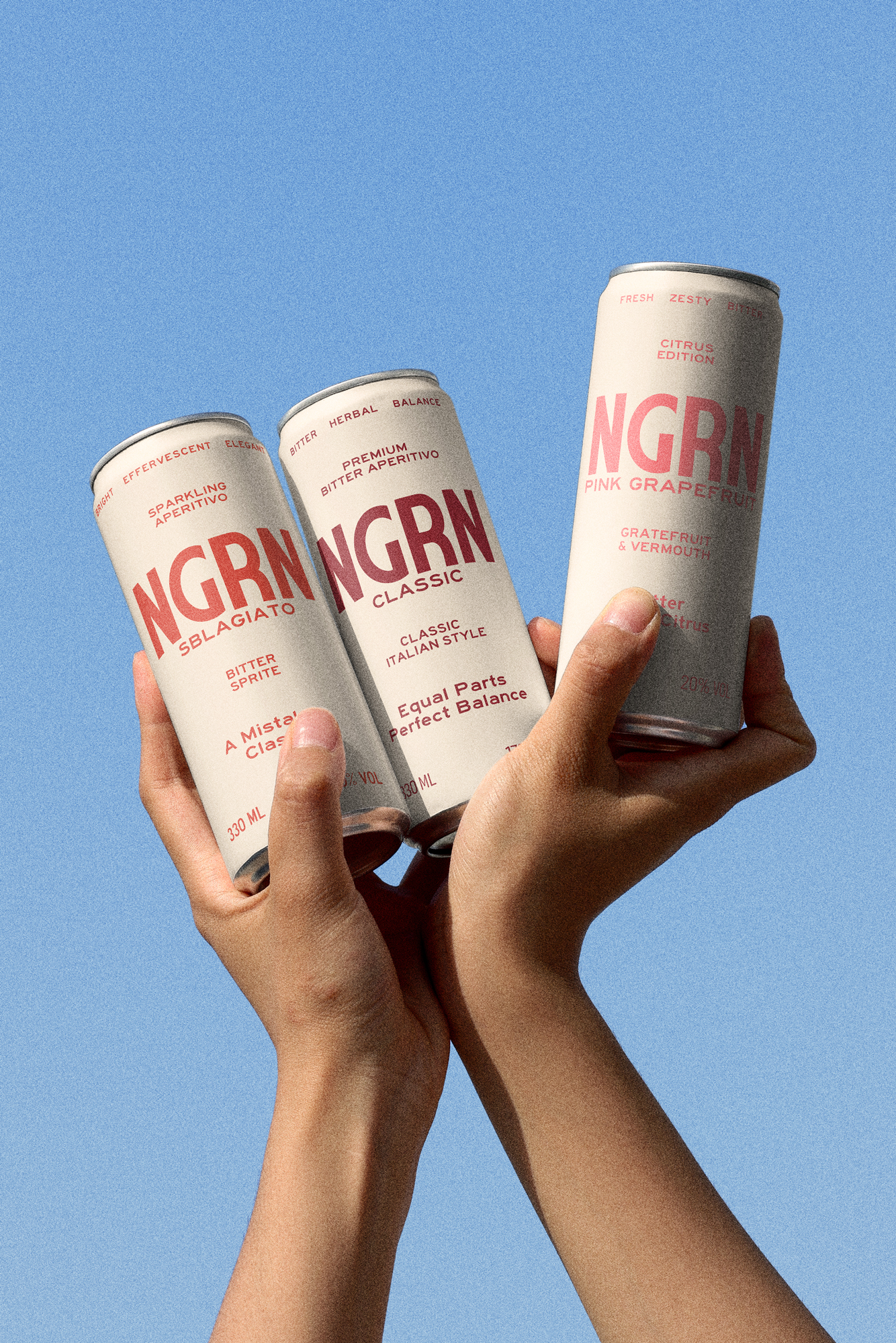
A curated spectrum of bitterness
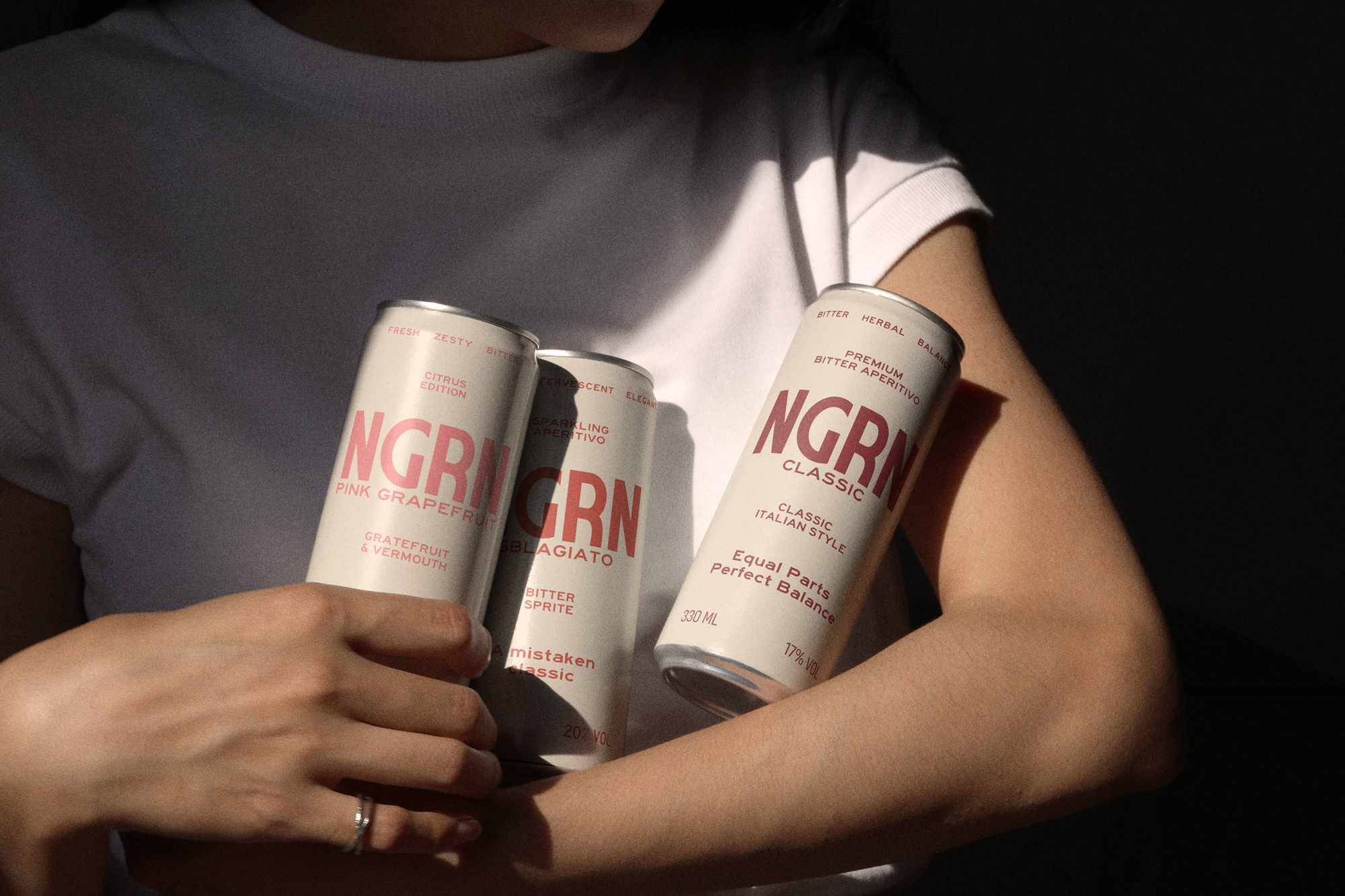
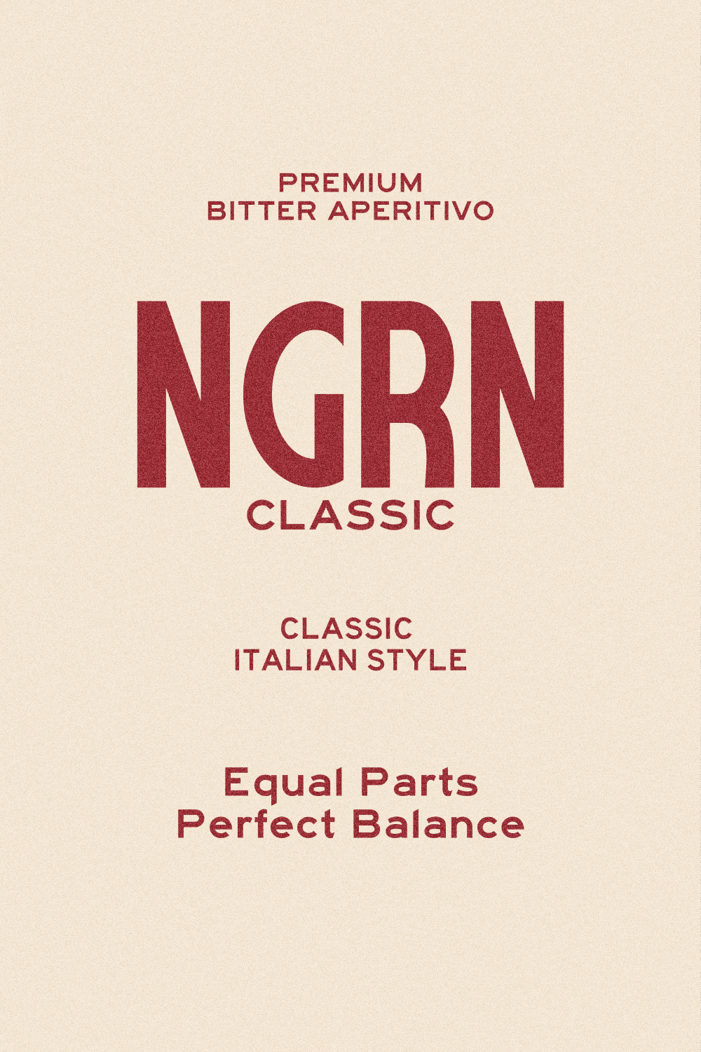
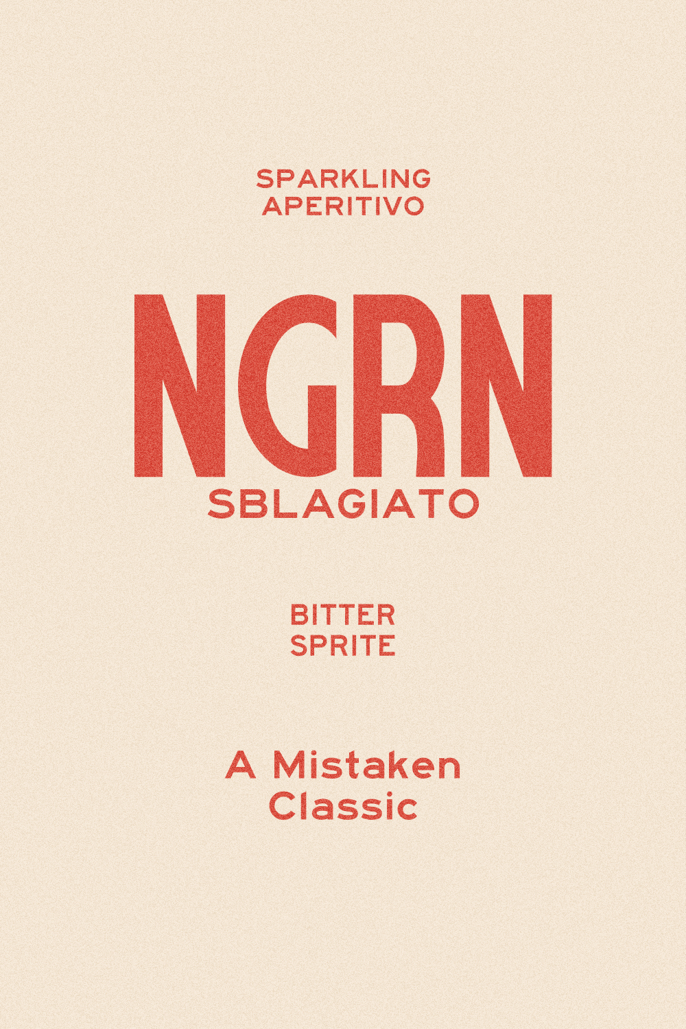
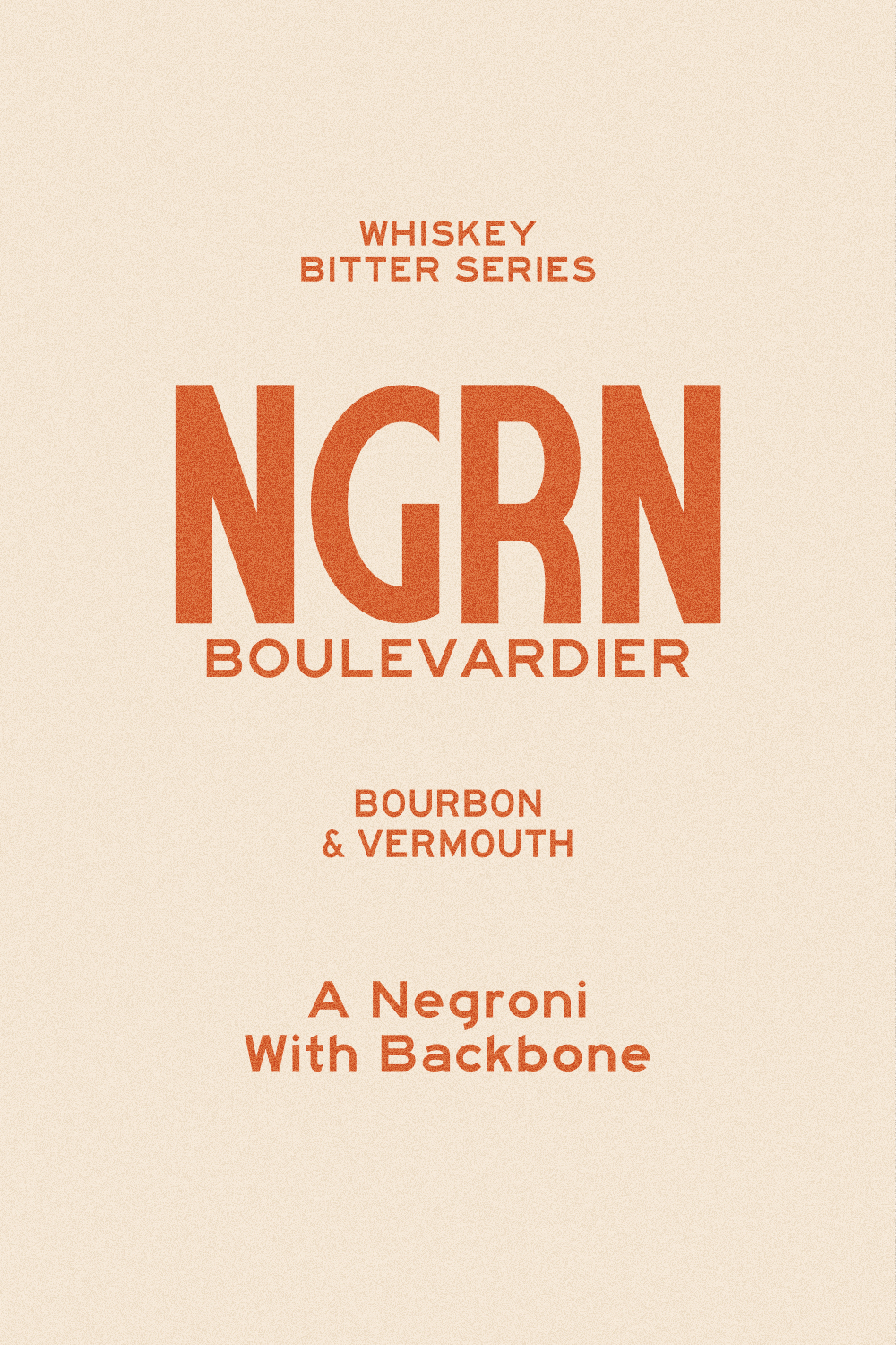
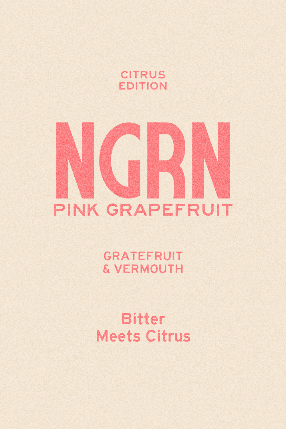
The visual identity of NGRN is built on intentional contrast. While the extra-bold sans-serif typography communicates industrial stability, the color palette injects the vibrant energy of the aperitif. We designed a chromatic system that acts as an instant flavor code: from Deep Red (Classic), paying homage to the original recipe, to Electric Pink (Pink Grapefruit), signaling bold innovation.
This palette isn’t just aesthetic; it’s a functional tool for consumers to navigate "bitter" intensity at a glance.
This palette isn’t just aesthetic; it’s a functional tool for consumers to navigate "bitter" intensity at a glance.
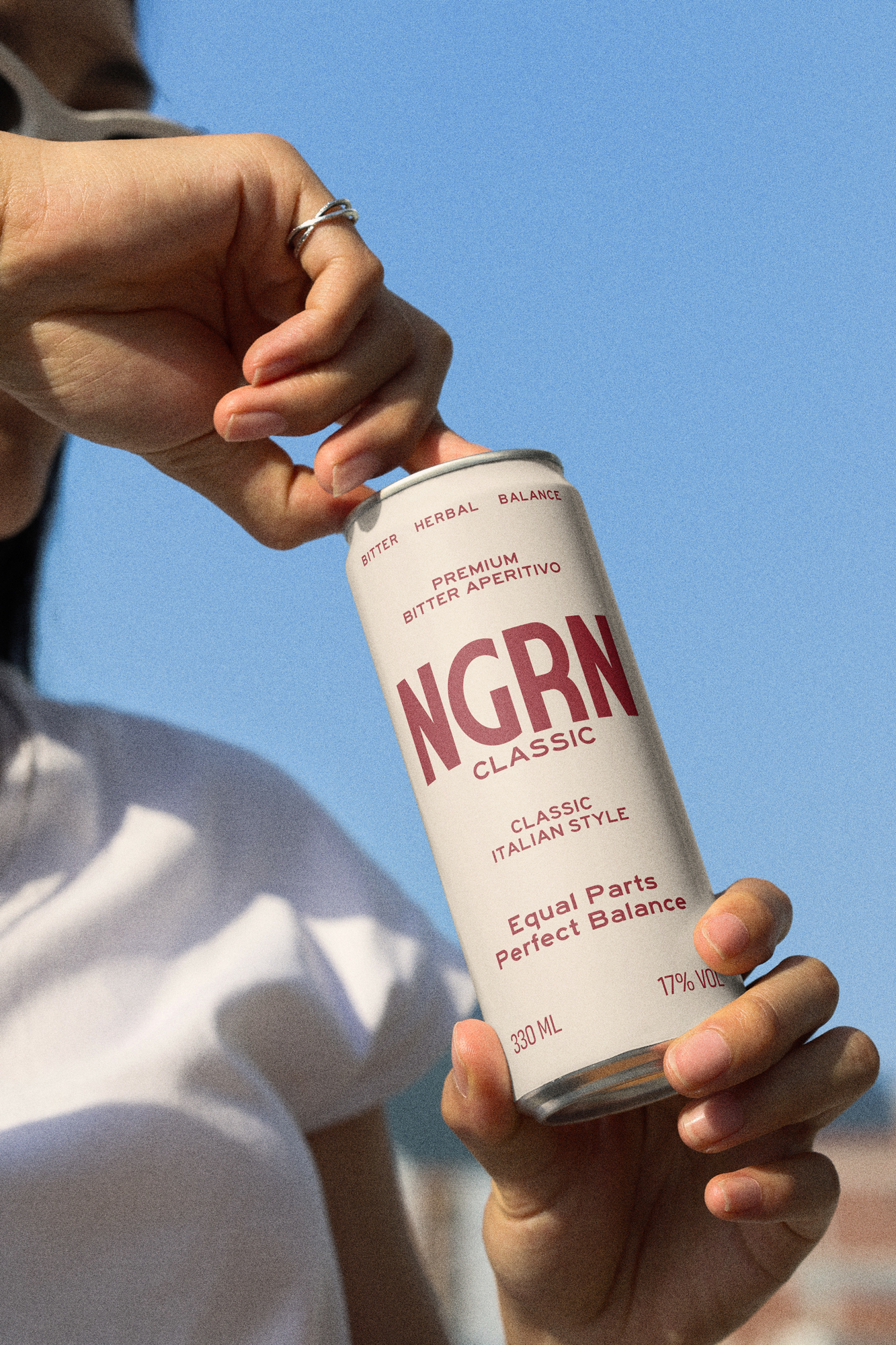
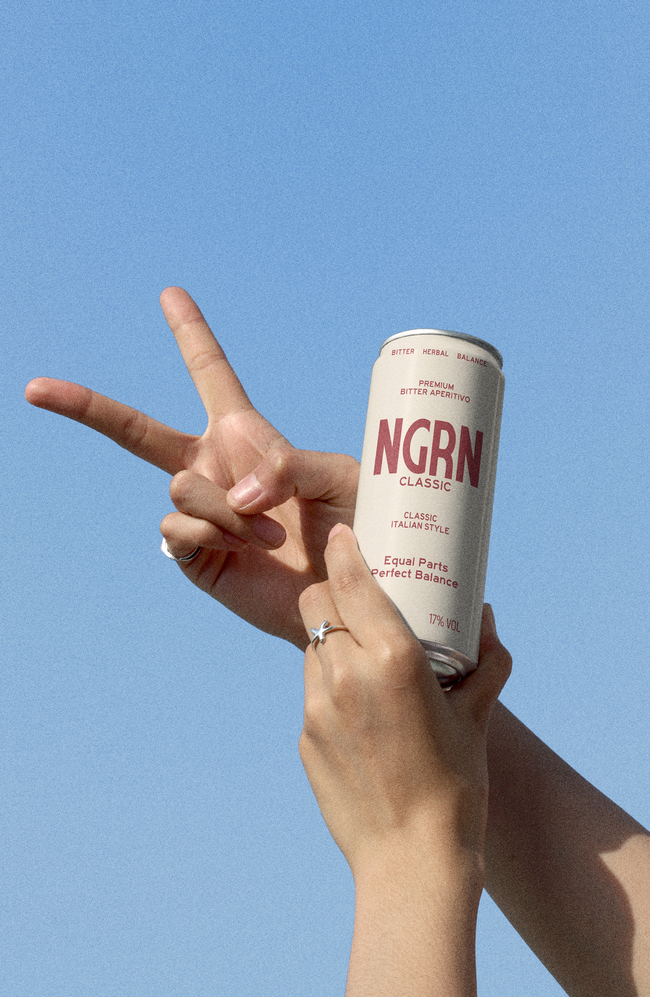
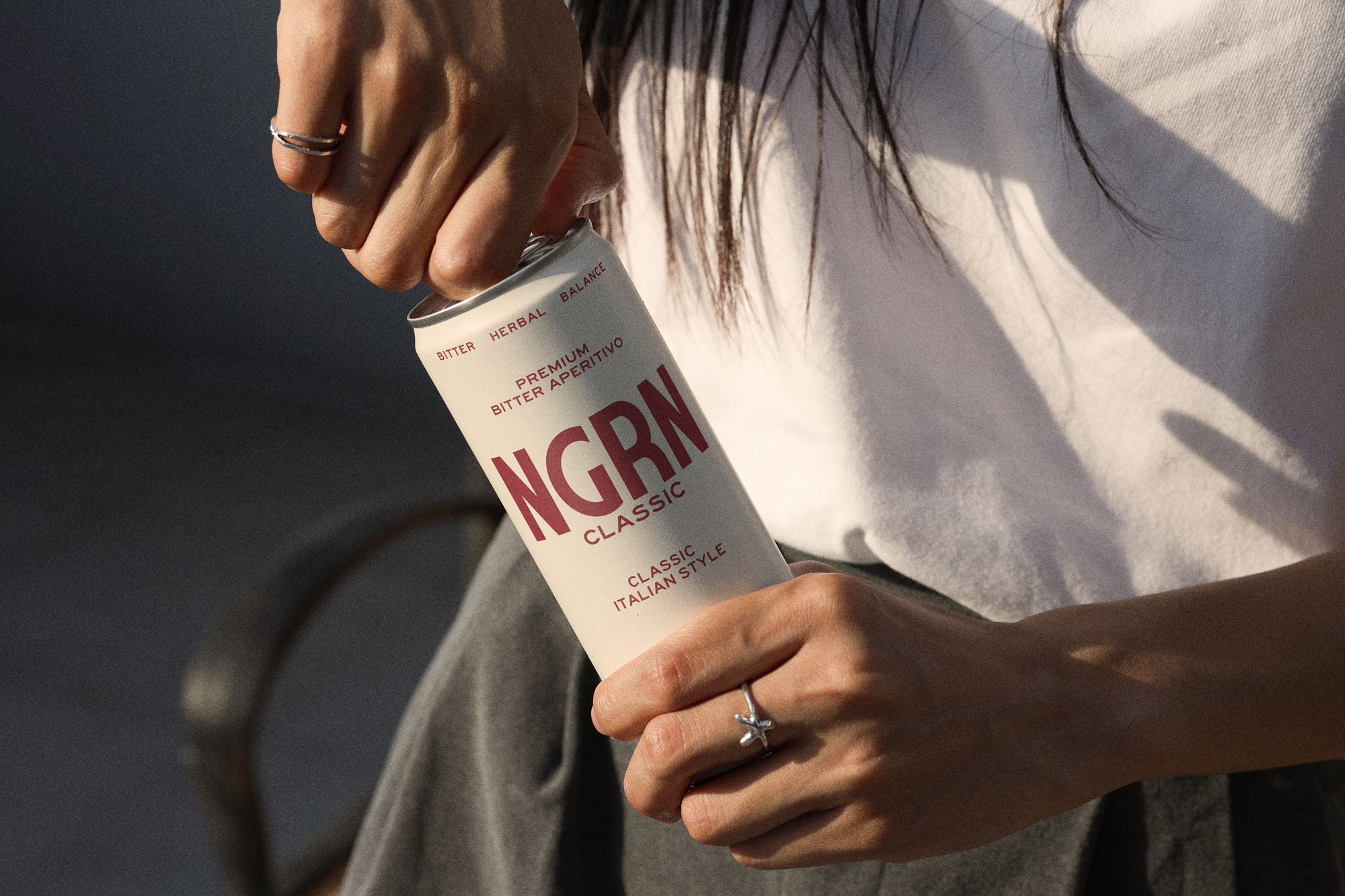
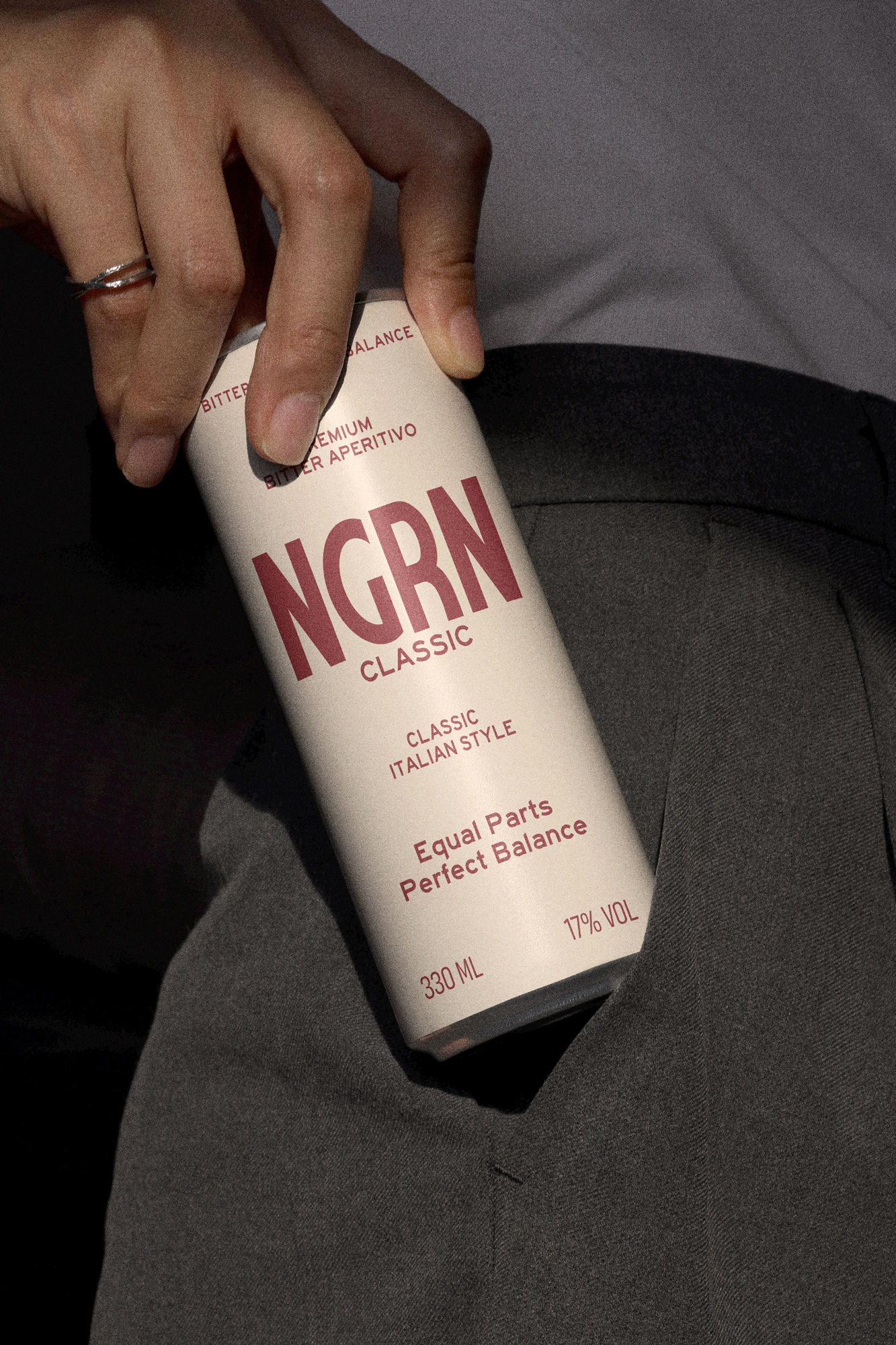
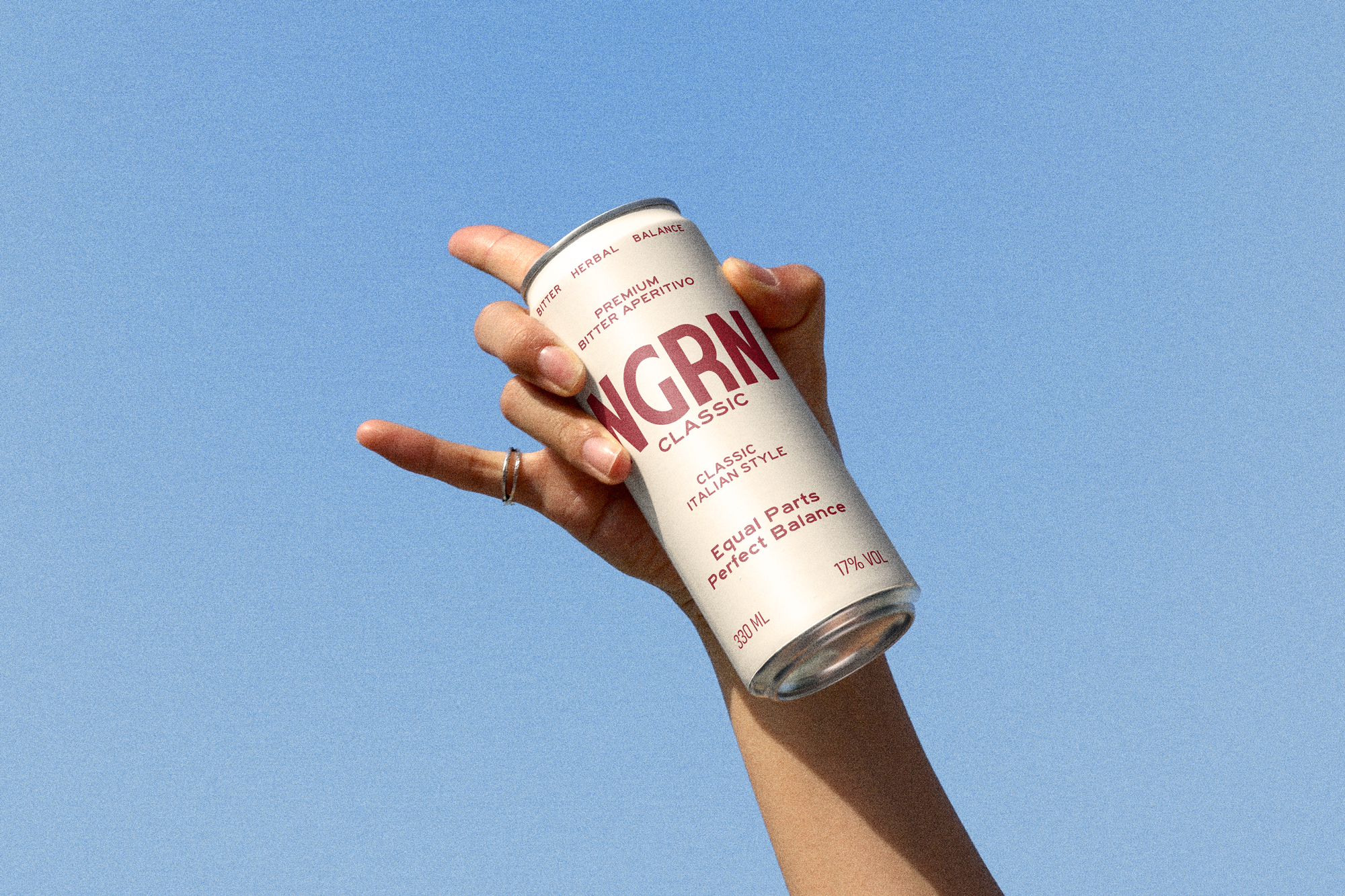
The Packaging
High-contrast design
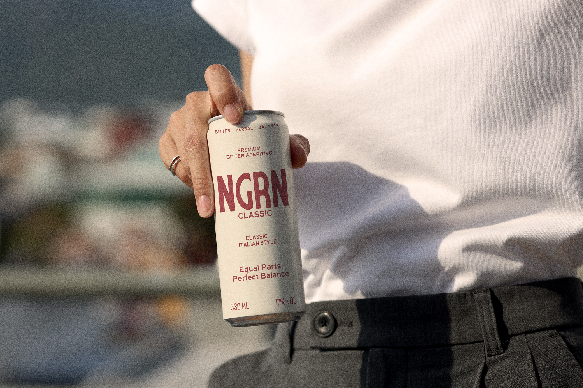
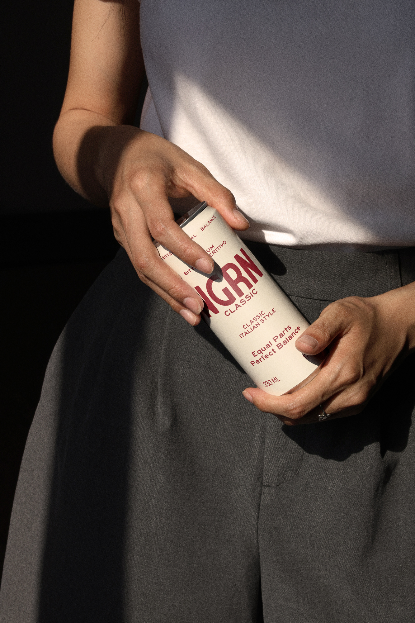
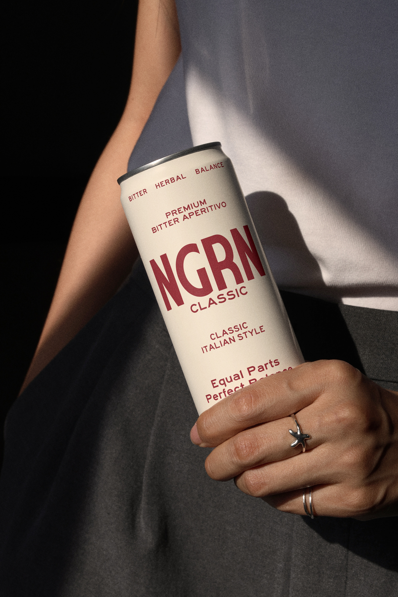
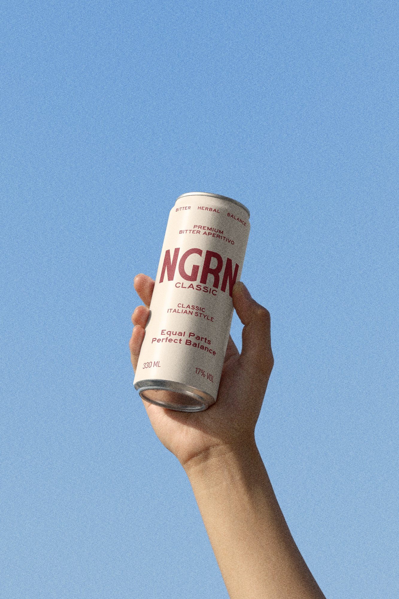
The can design utilizes these colors as solid blocks of information. In a saturated market, simplicity is NGRN’s greatest asset. By stripping away visual noise and focusing on the power of typography and the purity of these four tones, we transformed an aluminum container into an object of industrial design.
This is minimalism with a purpose: color doesn't just decorate—color defines the experience.
This is minimalism with a purpose: color doesn't just decorate—color defines the experience.
Next
Elite Batting Lab
Project